The Dos and Don’ts of YouTube Thumbnail Design for Click-throughs YouTube
In the vast ocean of online content, YouTube thumbnails serve as the beacon that captures the wandering eyes of potential viewers. These small, yet mighty, images play a crucial role in the success of your videos. Acting as the first point of contact, a compelling thumbnail can entice users to click and explore what your video has to offer.
The true measure of a successful YouTube video lies in its ability to engage and captivate the audience. Click-through rates, or the percentage of viewers who click on your video after seeing the thumbnail, directly reflect this engagement. A well-crafted thumbnail has the power to significantly boost click-through rates, leading to increased visibility and success for your content.
In the heart of this discussion is the central theme—the ‘YouTube Thumbnail.’ It’s not just an image; it’s the gateway to your content. Throughout this exploration, we will delve into the dos and don’ts of creating effective thumbnails that not only grab attention but also encourage viewers to take that crucial next step: clicking and experiencing your video.
Dos of YouTube Thumbnail Design
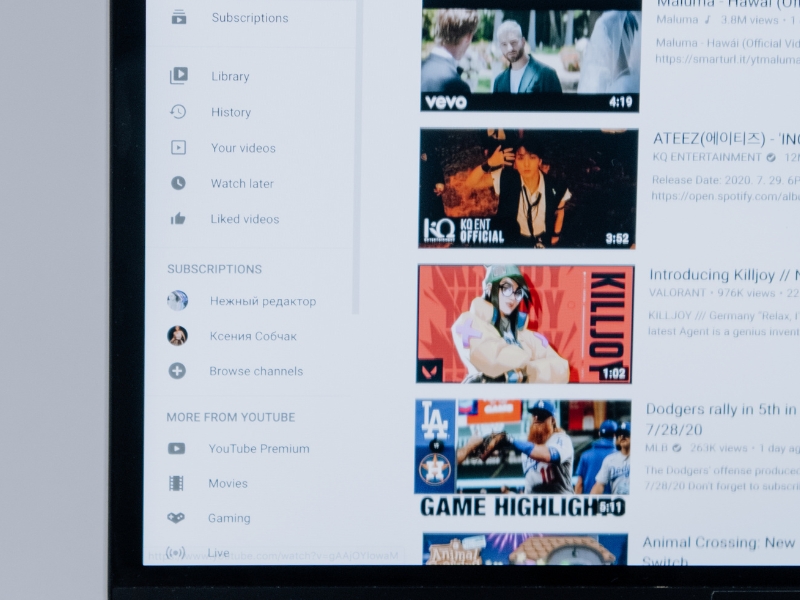
Clear Imagery
Use High-Quality, Relevant Images: In the realm of YouTube thumbnails, a crystal-clear image speaks volumes. Ensure that the visuals you choose are not only of the highest quality but are also directly relevant to the content of your video. A sharp, engaging image sets the stage for what viewers can expect, creating anticipation and curiosity.
Text Overlay
Incorporate Readable and Compelling Text: The power of words complements the strength of visuals. When adding text to your thumbnail, prioritize readability and relevance. Choose fonts that are clear and easily understandable, and craft compelling text that sparks interest. The goal is to provide a snapshot of what your video offers, enticing viewers to click for more.
Branding
Ensure Consistent Branding Elements: Establishing a strong brand presence is key to cultivating a loyal audience. Incorporate consistent branding elements into your thumbnails, such as logos, colors, or distinctive visual styles. This not only reinforces your brand identity but also aids viewers in quickly recognizing your content amidst the myriad of options.
Contrast and Vibrancy
Utilize Contrasting Colors for Visibility: To make your thumbnail stand out in a crowded digital space, leverage the power of contrast and vibrancy. Choose colors that pop and create a visual impact. A well-balanced combination of contrasting hues not only enhances visibility but also contributes to the overall aesthetic appeal, drawing viewers in for a closer look.
Don’ts of YouTube Thumbnail Design
Avoid Clickbait
Ensure Thumbnails Accurately Represent Content: Clickbait might catch initial attention, but it erodes trust and disappoints viewers. Thumbnails should provide an honest and accurate preview of the video content. Misleading images lead to dissatisfaction, negatively impacting your audience’s trust and the overall reputation of your channel.
No Crowded Thumbnails
Keep Designs Simple and Uncluttered: In the world of thumbnails, less is often more. Avoid the temptation to overcrowd your thumbnail with excessive details. A cluttered design can confuse viewers and dilute the impact of your message. Simplify your visuals, allowing for a clear and concise representation of what your video offers.
Consistent Branding
Maintain a Consistent Brand Identity: While consistency in branding is a ‘do,’ it’s equally important to avoid inconsistency. Strive for a balance. Random variations in branding elements from thumbnail to thumbnail can create confusion and dilute the recognizability of your brand. Keep it consistent to foster a strong and unified brand identity.
Simple Text
Avoid Overcomplicating Text on Thumbnails: Text on thumbnails should be a teaser, not an essay. Avoid overloading your thumbnails with too much text or overly complex fonts. The goal is to convey the essence of your video swiftly. Clear, concise text enhances readability, making it easier for viewers to grasp the message at a glance.
Importance of Testing and Iterating
A/B Testing for Thumbnail Performance
In the dynamic landscape of YouTube, where trends and viewer preferences are ever-evolving, A/B testing emerges as a powerful tool. Experiment with variations of your thumbnails to gauge performance. Compare different designs to see which ones resonate best with your audience. A/B testing allows you to make data-driven decisions, refining your thumbnail strategy for optimal click-through rates.
Adapting to Audience Preferences
The YouTube audience is diverse, and their preferences can vary. Stay attuned to the feedback and metrics provided by your audience. Analyze which thumbnails receive the most clicks and engagement. Adapt your designs based on these insights, tailoring your approach to what resonates most with your specific audience. Flexibility and responsiveness to changing preferences are key to long-term success.
Staying Updated with YouTube’s Guidelines
The YouTube platform is not static; it evolves, and so do its guidelines. Regularly check and adhere to YouTube’s guidelines for thumbnail design. Staying informed about any updates ensures that your thumbnails not only align with the platform’s requirements but also take advantage of new features or recommendations. Compliance with guidelines not only keeps your content accessible but also positions it favorably within the YouTube ecosystem.
Personal Insights
Share Personal Experiences with Thumbnail Design
In my own journey as a content creator, the world of thumbnail design has been a fascinating exploration. I’ve experienced the impact of a well-crafted thumbnail firsthand, witnessing the surge in click-through rates and engagement. I’ve also navigated the challenges of finding the right balance between creativity and clarity, discovering the nuances that make a thumbnail truly compelling.
Reflect on Lessons Learned
Through trial and error, I’ve learned valuable lessons in the art of thumbnail design. The dos and don’ts outlined in this blog post are not just theoretical; they stem from real experiences. Reflecting on instances where a thumbnail exceeded expectations or fell short provides insights into what works and what doesn’t. It’s a continuous learning process that contributes to the evolution of my approach to thumbnail design.
Encourage Experimentation
In the dynamic realm of content creation, there’s no one-size-fits-all solution. I encourage fellow creators to embrace experimentation. What works for one channel may not work for another. Try different styles, colors, and layouts. Learn from the feedback of your audience, and don’t be afraid to pivot if needed. The beauty of creativity lies in its endless possibilities, and each experiment brings you one step closer to discovering your unique formula for thumbnail success.
Final Words
As we wrap up this exploration into the world of YouTube thumbnail design, let’s revisit the key dos and don’ts. Clear imagery, readable text overlay, consistent branding, and the strategic use of contrast and vibrancy emerge as essential dos. On the flip side, avoiding clickbait, steering clear of crowded thumbnails, maintaining consistent branding, and keeping text simple are critical don’ts. These guidelines serve as a roadmap for crafting thumbnails that not only catch the eye but also drive clicks.
Never underestimate the impact of thumbnails on click-through rates. In the vast digital landscape, where attention spans are fleeting, a captivating thumbnail is your best ally. It’s the gateway to your content, the visual handshake that invites viewers to take the next step. The dos and don’ts discussed here are not just suggestions; they are the building blocks for elevating your click-through rates and boosting the overall success of your YouTube endeavors.
In the ever-evolving landscape of content creation, adaptability is key. I encourage you to view thumbnail design as a dynamic process. Embrace ongoing experimentation, learn from each iteration, and adapt to the changing preferences of your audience. The beauty of creativity lies in its ability to evolve, and as you continue to experiment, you’ll discover the unique formula that resonates with your viewers. So, don’t be afraid to push boundaries, try new ideas, and enjoy the journey of crafting thumbnails that captivate and compel